Friday, September 27, 2013

How to Photoshop


Step One:
Start up Photoshop from the Start menu, and select “Edit” from the welcome screen.


Step Two:
Select File/New/Blank File (CTRL+N)
Set up the file size to your liking.  A width of 600 pixels, height of 400 pixels, and resolution of 72 pixels should work fine for this tutorial.

Step Three:
Get to know your workspace.  Down at the bottom right is the “Layers” pallet. 
From here you can move layers around, add new layers, delete layers, mess around with layers, turn layers off, turn layers on.  Pretty much, you can do all the layery things you’d like. 

Things to note:

The Opacity of a layer determines if it is “see through” or not.

Clicking the eye beside a layer will hide and show it.

Clicking the lock beside a layer will prevent you from moving / editing that layer.

The little page in the bottom left adds a new layer.

You can change the name of a New Layer by double clicking on its name.

The half white, half black, circle allows you to create “adjustment / effect” layers.  Try some out for yourself.


Step Four:  Get to know your Tool Bar
The top left arrow lets you select objects and move them around.
The magnifying glass lets you… magnify things.
The hand lets you drag the canvas around, if it’s bigger than your working window.
The eye dropper allows you to change your foreground colour to what you click on.
The dotted rectangle lets you create a rectangle selection.  Hold the button down over it, and you can choose a rounded selector too.
The lasso allows you to create a custom selection.  Hold down that button and you can choose a Magnetic Selector (that will cling to things of similar colour) or a polygon selector that lets you choose angled points.
The Magic Wand selects everything of a similar colour to what you click on.
The wand to the right of it is similar, but grabs large areas as you “paint” with it.
The T lets you type.
Beside the T is the crop (resize) image option.
The rest I have faith in your ability to figure out by playing around with them, and paying attention to their tool names.

Looking to the bottom you will see two squares – this allows you to choose your foreground and background colour.  You will be able to paint with these (using the brushes).  Note, you can swap the two colours by clicking on the arrow that points to them both.  Double click a square to set the colour you want for it.

Step Five: Create a new layer.  Call the layer “Orange Circle.”
Next, Grab the Circle Tool and draw one (make it Orange just because you can.)  First, change the foreground colour to orange, then hold the mouse button down over the rectangle (the one beside the water droplet, near the bottom of the tool bar.  Select the Oval tool.

You may have a hard time making a perfect circle – BUT – if you hold down the [SHIFT] key while you form your circle, it will be perfect every time.

When you release you will notice you’ve created a new “shape layer” but we don’t want that.  We want it to just be part of the image.  So – right click on it, and select “Simplify Layer”.  This will turn it into a regular everyday layer, and you’ll be much happier.

Next you’ll notice that the orange circle isn’t on your “Orange” layer, but rather on a “shape” layer above it. 

Right click on the layer and choose “Merge Down” (alternately CTRL+E) now you’ve merged the shape layer with “Orange” (provided that you had the Shape layer selected… which you should have, if you followed the steps.)


If something goes wrong, remember you can always CTRL+Z to undo your mistakes.

Step 6:
Working with the Lasso…
Select the regular lasso and try to select the circle, perfectly.  You’ll notice it’s more like one of those bad infomercials where someone can’t cut an onion without the new product of the month.  But fear not, we’ll try with the polygon tool. 

To get that, remember – long click on the lasso until it pops up your other options.  Select Polygon tool.  You’ll notice it’s a bit easier, but still not rounded.  Next up, try the Magnetic lasso.
You’ll notice this is much easier.  It may be too sensitive at first, but watch how the lasso clings to the similar colour, allowing you to be precise with your selection.  You should be able to perfectly select your circle this way.  BUT…

To make things easier, since the circle is all one colour, click on the Magic Wand tool and then click on the circle.  Perfect selection!


Step 7:
Messing with Selections is fun and easy.  For example, let us take a small chunk out of our circle’s selection.   To do this select the polygon lasso.  Hold down the [ALT] key and you will notice a little (-) minus sign appears by the tool.  This lets you know you will be removing pieces from your selection.  Note: This will not affect your image, just the dotted selection.
With your circle selected, and the ALT key held down click in the middle of your circle.  Make a triangle, and then join up your selection with the first click you made.  You will notice your selection now has a piece missing.

We will now play with the new 3/4 circle selection.
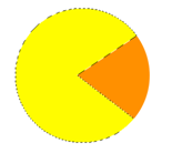


Step 8:
Changing colours…
Double Click on the Orange Foreground colour and change it to Yellow.  With this done, select your paint bucket.  It’s the tool above the Circle Creating tool.

With a Yellow Paint bucket Selected Click in your selection and you will notice the selected area is now yellow.  But there is still that one orange wedge.


Step 9:
You have a selection, but you can also INVERSE your selection.  Basically that means select everything that is not CURRENTLY selected.  To do this go to the Menu bar at the top, Select / Inverse Selection (CTRL+SHIFT+I)
Now, it may not look like your selection has changed, but I assure you that it has.  See the dotted line around the border of the screen now? 
Change your foreground colour to black.  Now click in the white area.  Changed!  Now all is black, but not the orange – even though it was part of your selection.  You will only affect an area of similar colour with your paint bucket.  True story.  Press CTRL+Z to undo the pain bucket and then paint the orange area.  See how the white stays white?

Now click on the white area too – and you have a yellow three quarter circle on a black field.

But wouldn’t it be easier if the black field was its own layer?  Of course it would be.  So just hit the delete key – and all that black (everything in the selected area) goes away!

You may notice some black along the mouth of the yellow area – this is because your “selection” is not pixel perfect.  It “feathers.”  This allows some blending which is important with photo editing.  Google feathering if you want to learn how to change this around.

Now hit [ESC] to remove your selection, select “Background” layer and just paint bucket that black.


Step 10:
Select your top right tool, that lets you move things around.  Click on your yellow object, and you will notice “Orange” layer is now selected.  Move that object as far to the middle / right of the screen as you can.  And while you’re at it – change the layer name from “Orange” to “Yellow”.  Surely you remember how – even though it was way back in an early step!


Step 11:
Create a new layer called GHOST.

With Ghost layer selected, grab the Elliptical selector tool.  It’s under the hand.  Long click on it if you just see the Rectangle one.  Draw an elliptical selection on the screen.  Then switch to the rectangle selector tool.  Hold down ALT and cut off the selection right in the middle.


Next, hold down the shift key.  Where there was a Minus when you hold ALT there is now a (+) plus.  Be as precise as you can and add a rectangle to the bottom of your half circle selection.
Using the Elliptical selector tool, round out three little circles at the bottom – then fill in the whole selection Orange (because Clyde is the best.)


Finally use your circle creators to add big eye whites and blue pupils to your orange ghost.  Then add a small white circle inside the yellow area’s mouth, and a bigger white circle (a power pellet, if you will) in front of the ghost… so – you know – Pac-Man won’t die.


After you’re Finished:
So you’ve created your image – learned about selector tools, objects, and layers.  You’ve got a good handle on how to use photoshop now.  However, there are some more things to try out.
Remember I said the opacity bar toggles the “see-through-ness” of a layer?  Try playing around with that by selecting layers and turning them down.
Turn down the ghost – then move pacman over the ghost – then turn the opacity back up.  See what’s happening?
You  can also try out the “Adjustment Layers” (the white and black circle) and try moving them around to see how their positioning affects the image.

Basically – at this point, you’ve created your “Nerd Flag” and now just need to try some things out.  If you’d like, copy and paste a picture into photoshop and try playing with that too.


Thursday, September 26, 2013

Windows into Lives


Haze and glare and light pollution obscure the stars burning brightly above the urban streets.  However, it has been said that deep within the city one doesn't need to see the stars, because the stars are all around them.  Every window tells a story.  Constellations form in the illumination of office towers, residential apartments, and downtown condominiums.

Every window is a portal to another life, another set of experiences, and another way of viewing the world.  And there are windows in every town, in every city, in every country, on every continent, on the planet.  Over seven billion unique story tellers wait to share their vision of the cosmos here on Earth.

Out My Window is an interactive multimedia presentation presented by the National Film Board of Canada (NFB).  It tells a number of these tales.

Step One: visit Out My Window (http://outmywindow.nfb.ca/#/outmywindow)

Step Two: explore a number of the windows, and tales, within the multimedia experience

Step Three: choose two of the windows, and write a one paragraph explanation for each.  In your paragraph you should touch upon how their lives are both similar and dissimilar from your own.  Juxtapose their experiences with your experiences and try to imagine yourself in their shoes.

Step Four: Imagine what your window might look like to others, hoping to look in.


Follow up: For tomorrow's class you will need a digital picture of your bedroom.  The picture of your bedroom should be taken in such a way that it summarizes who you are as a person - allowing anyone who sees the picture to gain insight into what makes you you.

You may need to move objects around to stage the image.

What's in a Room?

1.

2.

3.

4.
5.

6.

7.

8.

9.

10.

11.

12.

13.

Step 1: Choose one of the bedrooms above

Step 2:
Answer the following questions, and write a sentence or two to justify your answer. (for example, "1. Boy." is not an acceptable answer.  However, "1. I think the rooms owner is a boy, because of the pirate ship in the background, and the use of dark green and blue in the wallpaper.  These are colours normally associated with males, as is the romanticized nature of pirates." would be a solid answer.)

  1. What is the Sex or Gender of the room's owner?
  2. What is the age of the room's owner?
  3. What is the socio-economic background of the room's owner?
  4. What hobbies does the room's owner have?
  5. How do you think the room's owner spends their Friday nights?
  6. What do you think the room's owner does when they hang with their friends?
  7. What are the top 3 books of the room's owner?
  8. What are the top 2 songs of the room's owner?
  9. What is the top website of the room's owner?

Step 3: Write a one paragraph diary entry in the voice of the room's owner.

Monday, September 23, 2013

Vectoring - Final Project


Typography Assignment Due: Thursday, September 26th, 2013

What: You are to take a digital photograph of your mother or your father. In an event where such a photograph would be impossible, choose another close family member, or someone whom you consider, “family.”

You will then vector their face to create one image. This image will be saved / exported as PNG.

The second step is to learn about this person – things that matter to them, and things that they feel strongly about. Using your typographic knowledge, you will choose fonts / text that work to summarize their personality. This will then be exported as PNG as well.

Both images are to be uploaded to your blog no later than September 26th, 2013.

Mark Breakdown
Knowledge /50
  • understanding of Inkscape demonstrated in final product
  • image vectored
  • no background image in final export
  • text layer applied atop image
  • vectored image visually pleasing
  • vectored image could be used for professional purposes

Thinking /30
  • subject of image suits the assignment
  • text used suits the assignment

Communication /15
  • text used is visually pleasing, with proper font / colour choices
  • no spelling / grammatical errors

Application /5
  • final product would make a lovely holiday gift for subject

Thursday, September 19, 2013

Introduction to Typography

Initial Typography

Introduction:
By this point you should know how to organize your work in a way that makes sense to you. I recommend layers, but as this is art – it’s the final piece, not the process (some will disagree strongly here – including me, from time to time) that matters. Work in whatever style best suits you. But know, if you don’t use layers, that choice may come back to bite you.

Step 1:
Using the text tool (two down from the curves tool – the one with the big A on it) click on your page. Type the first letter of your name. Then select the arrow tool. Either holding CTRL to maintain the aspect ratio, or not holding CTRL to modify the shape to something that pleases you, stretch the letter so that it takes up a large part of the page.

Note:
With the text tool selected you can change the font to whatever style best suits you. Go through them and pick one that stands out to you. Keep in mind that a more “blocky” font will make the rest of this assignment easier. But, perhaps, that’s not what you’re looking for.

Step 2:
On the Layers pallet, change the opacity of the layer your letter is on to 20% (or there about.) Changing the opacity will make your layer see-through. Were there an image below, it would start to show. As there is nothing below, the letter simply gets lighter.

You will be typing in black, over top of this letter. Because of that, you need to lighten the image. Ultimately your initial letter will be all but removed.

Step 3:
Using the grey letter as a guide, you are to write text over top of your letter, keeping – more or less – within the lines. Changing the font size, and type, can be an effective way to make certain lines stand out, while adding personality and interest to your piece.

The text you use should be:
- Favourite Quotes
- Important Moments in Your Life
- Things that matter to you

Keep typing until the whole letter is filled. You will notice that this is by far the most time consuming part of the project. It’s not hard – just, time consuming.

Step 4:
Time to colour that text. Choose a colour scheme that matters to you. Two colours. Maybe some blues and greens? Pinks and oranges. Whatever. Figure out two colours and then choose the gradient tool. It’s below the paint bucket, and above the dropper.

With all your text selected, draw a blue line with the gradient tool from the top to the bottom of your text. Remember, all text layers need to be selected at once for the desired results.

At the top of the screen, there will be a box reading “edit” beside your currect gradient (possible Black to Transparent as default.) Click Edit.

In this window there is a drop down menu with “Stops.” These are there the gradients change. You can simply edit the first and the second changing them to the colours you want, and all will be well. However – should you want more than two colours, simply

Step 5:
Create a layer beneath all other layers, and create a black box the size of your Page.

Step 6:
Your initial giant letter, change the colour of it to a dark grey so that it can just barely be seen behind your text. It should be a subtle shadow of a letter, barely visible. Perhaps the 90% grey, second from the left. You might want to play with the opacity here a bit.

Step 7:
In white, choose a font to your liking and write your name, centered, with a personal quote beneath it. Maybe toss a blur in behind? You’re done.

Friday, September 13, 2013

Vectoring a Face


Vectoring a Face

What you will learn:
- how to add sublayers (this is harder than it should be with Inkscape)
- how to lock layers
- how to simplify a complex image
- how to use the blur effect
- how to specify the exact size of a page


Step 1:
First, you need to grab an image. Ms. Maletin has kindly volunteered (somewhat - kinda-sorta… well, she didn’t outright object… well – when she outright objected, she didn’t seem to stay upset. For long. You know what, lets just keep this quiet, alright?) an image to be used for this assignment.

You’ll need to toss this image into Inkscape, and that shouldn’t be a problem by now. Nope. You have the excellent skill sets that allow for copying and pasting. Good for you. So go to it, open up inkscape, and throw this image in. You will see that it’s on its own layer.

Note: when creating objects, fill them with whatever colour you think works best.


Aside:
A vectored image can be resized to any dimensions you want, without losing quality. Unlike this rastered image above, you could resize the vector file to be as big as thirty football fields, and it would still remain crisp and clean – not pixelated. The reason for this is because we’re not working by changing one or two pixels. Remember the complex math I told you about before? The stuff that you don’t need to know about? Well – through it’s magic, the curves keep the image produced perfectly. But enough of that, lets get creating.


Step 2:
You need to get back into the Document Properties (remember you can do this through the File menu, or with the CTRL+SHIFT+D hotkey.) Once you’re there, you need to look for the box that reads “Custom Size.”

Here you can edit the Height and Width of your document. You want to input a width of 1024.00, and a height of 768. The units should be px (this stands for pixels. If you make the document 1023x768 inches, it will be ridiculously big, and might slow down your editing process.

Once you’ve input these numbers you should notice that the size or shape of your Page changes to reflect this new information. Good for you, you have now set yourself up to get started creating a wallpaper.


Step 3:
Resize the image so the face takes up a large part of your page, and is – more or less – centered. Then, open the Layers Pallet and click the little lock beside the background layer. This will prevent you from moving the image, or accidentally selecting it when you’re editing the vectored image.


Step 4:
Alright – here’s where things can get really tricky really fast. We’re going to start using sublayers. In most programs you can drag and drop layers to achieve this, which makes it simple. Here you need to think ahead, and create layers properly.

Never mind all that though, we’ll learn by doing it. Click on the PLUS to add a new layer. Note that it says Position: Above Current. That’s good for now. Click Add. Rename the layer to “Maletin Face”.

Now you need to have Maletin Face selected as a layer. You’ll click the plus once more to add a new layer. This time you will call the layer “Face Base.” As for the position, it will be a “As a sublayer of current.” Then click on Add.

You have just created your first sublayer. Note that Maletin Face now has a little minus sign beside it? That will allow you to expand / close the sublayers. There is a reason why you will want to do this, and I will explain it to you now.


Aside:
Sublayers do nothing for the editing process. Neither do layers for that matter. You could create your whole image on one layer if you wanted to, but when it comes time to edit, and fix things up it will be a terribly messy operation. Think of layers as a way to organize your progress. You can select everything on one layer, and affect it separate from other pieces.

You can also easily turn layers on and off to see behind them, and visualize how one layer affects another. Sublayers are a way to group pieces of similar information together.

Because sublayers are so tricky in this program, I will accept if you don’t want to use them – but it may make things simple for you. When I tell you to make a new sublayer, you can choose to follow those instructions, or continue to just make regular layers. That choice is yours to make. But try out both styles to see what works for you.


Step 5:
With Face Base selected, trace the basic shape of Ms. Maletin’s face. You must be precise on the left side of her face, but if you overlap her hair, that’s fine – the foreground hair layer will be on top of the face base, thus covering up the overlap. Note that we’re also ignoring her hand, as if it doesn’t exist? Look back at the final image, shown at the top of this tutorial. No hand to be seen at all. While vectoring we can ignore objects we don’t think would benefit the final image.


Step 6:
Create a new layer named Foreground Hair. Trace the hair, once more pretending that her hand isn’t there. You should start from the center point of her part, and work down, making sure to curve with the shape. At the bottom of the hair, you can choose to create a design that makes it look more natural than a straight line would.

Once finished, create a layer called Background Hair and move it below “Face Base.”

Trace Maletin’s hair precisely along the left side, where it will be seen. Once behind the skin layer, however, you can do whatever you want, as it will be hidden by the Face Base layer.

Once complete you will have the basic pieces required to make a face. Good for you, you’re – well, you’re on your way.


Step 7:
Remember that little minus sign beside Maletin Face? Well now it’s time to click it. If you have been creating sublayers, you will notice that they all disappeared. Don’t worry they still exist, you just can’t see them individually anymore. Isn’t that a cleaner way to edit images? Also – since you need to turn off all the hair and face objects that you just made, you can now click on the eye for Maletin Face and all three will turn off at once.

Give it a shot, and turn it on and off a few times to familiarize yourself with the process.

Right. Next, create a layer (not a sublayer, but a brand new layer) and call it “Face Features.” Position this layer above Maletin Face.

Next, create a sublayer of facial features and call it “Lips.”

Next, create a sublayer of “lips” (yes you can make sublayers of sublayers) and call it “top lip.”

Finally, trace Maletin’s top lip.

It should seem obvious, but the next step is to create a new layer called “bottom lip.” This should be a sublayer of “Lips” as well. Move the “bottom lip” layer below “top lip.” This way you need only be precise when editing the lower half of this lip. The top will be covered by the “top lip” layer.

Once the lip has been created, you can press the minus sign to close the sublayers, leaving you with a well organized file, and two lips floating on the image. Phew! That was a big step, but it’s building upon skills we already have. I’m sure you all got through it fine, right? Otherwise just cry out: “Sir! I need help! Sir! Sir! MEDIC!” Someone’s bound to show up, yeah?


Step 8:
It’s time to do some fine details. Note that rather than adding colour for every dark and light stop, there are a relatively small amount of colours in the final image. The only real colour change on Maletin’s face is the slight shadow to represent her nose. The reason these shadows are not needed more than that is because some detail lines imply depth.

These lines are used for her nose, her chin, and the indentations above her eyes.

Create a layer called “face lines” as a sublayer of “Face Features” and draw in the required lines, being sure to cure them precisely.

You will do this with the curves tool. Rather than having the end of the object finish when you close the object, you can [right click] the mouse to end your current curve.

If you turn back on Maletin Face, you will notice that things are finally starting to look the way they should. There’s a face there after all!


Step 9:
Make a new sublayer of Face Features and call it “nose shadow.” Trace the shadow of her nose, while using the black lines you’ve created as a guide. You can use them to form your curves, as the nose shadow layer should be placed below “face lines” This will make the lines tight, and clean.

Now create a layer, also sublayered of “Face Features” and call it “eye brows.” The instruction here should go without saying by this point, but for posterity I will tell you that now you should trace her eyebrows.

We’re almost done… all that’s left are the eyes. It’s just to bad that they happen to be some of the most difficult things to work on.


Step 10:
Create a sublayer of “Face Features” and call it “Eyes.” Then create a sublayer of “Eyes” and call it “white eye.” You will now need to turn off “Maletin Face.”

Trace the entire eye until you are satisfied with your results. Note how I used the line of her nose to blend the left eye smoothly with her face. This is accomplished by simply moving the “Eyes” layer below the “face lines” layer.

For the first time, I want you to turn off the “Stroke Line” in the Fill and Stroke pallet. White the stroke lines work well with other aspects of this image, eyes should be clean. You will also need to do this to ensure a smooth clean line where the right eye blends with the foreground hair.


Step 11:
Create a new sublayer of Eyes and call it “iris.” Here you will trace the coloured parts of her eyes, the Irises. They may be hard to see, but you should be able to figure it out. I have faith. The “iris” layer must be on top of the “white eye” later. You will also need to turn off the “white eye” layer to trace these objects.

Next create a new sublayer of “Eyes” and call in “pupils”. This should be on top of “iris.” Here you just need to add black circles where you think they best fit. At times an oval may work better to imply directed sight.

Now we’re down to the final step of the face.

Step 12:
Create one final sublayer of “Eyes” and call it “lashes.” Here you will trace the curves of her eye lashes, turning a complex number of single hairs into one tight object. Putting some points on the brows, as I have done, can add to the stylistic interpretation, as well as add a sense of menace to the final product.


Note: You’re almost done. All that’s left is the final two steps to turn this image from a sweetly vectored cartoon simplification into a sweetly vectored cartoon simplification that you can use as your desktop wallpaper – you know, if you were into that sort of thing.


Step 13:
Create a layer – a real layer, not a sub layer – below “Maletin Face” and call it “Black.” This can be either below or above “background,” as when you export the final image you’ll have the background image turned off. In “Black” you should create a big black box using the rectangle tool (below the magnifying glass). The black box should be the same size as your page, matching it exactly, or being slightly bigger.

Step 14:
Finally create a layer just above “Black” and call it “Blur.” Here you will create the misting blue effect in the background.

Create a curved object, looking like a blob, around her head. Fill it blue.

Next open up the Fill and Stroke pallet, and, with the blue blob selected, drag the “Blur” slider to 46%, and the Opacity slider to 77%. The blue number creates more or less bluring of the object. The Opacity slider makes it more see-through.


Oh my gosh! It looks like you’re done! All you need to do is export the file, and you’ll have a nice new desktop wallpaper!


Step 15:
Go to File / Export Bitmap (or press CTRL + SHIFT + E). There are a lot of options here, and we’ll explore them more later. For now, just follow along. When looking at the Export Area, select “Page.” This should change the size to 1024x768 (which you set way back in the first step.)

Under filename, choose a directory that you know the location of, and name the file “Maletin Wallpaper.png” Click export.

Open up that file, and you’re done. Wallpaper created. Good for you! Success! Achievement Unlocked! We out.


Assignment:Once you have finished the above tutorial find a suitable picture of your face (or take one, yourself).  Vector the image of your face using proper layers. By this point you should have all the skills you need to create a full image without step by step instructions.

Your face vector will be evaluated on the following criteria:

Knowledge
- Vectored image shows use of layers via. overlapping channels
- Long smooth curves are evident, rather than many nodes creating a blocky curved line


Thinking
- Colour selection is relatively photo accurate
- Shading is appropriate for the image you selected

Communication
- Accurate representation of your face
- Shows an understanding of the assignment's tutorial

Application
- Accurately follows tutorial instructions
- Results in a well developed stylized image of you, suitable for logo purposes