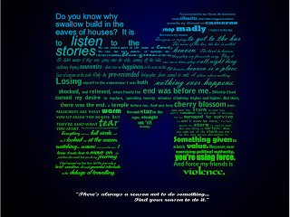
 Introduction:
 By this point you should know how to organize your work in a way that makes sense to you. I recommend layers, but as this is art – it’s the final piece, not the process (some will disagree strongly here – including me, from time to time) that matters. Work in whatever style best suits you. But know, if you don’t use layers, that choice may come back to bite you.
 Step 1:
Using the text tool (two down from the curves tool – the one with the big A on it) click on your page. Type the first letter of your name. Then select the arrow tool. Either holding CTRL to maintain the aspect ratio, or not holding CTRL to modify the shape to something that pleases you, stretch the letter so that it takes up a large part of the page.
Note:
With the text tool selected you can change the font to whatever style best suits you. Go through them and pick one that stands out to you. Keep in mind that a more “blocky” font will make the rest of this assignment easier. But, perhaps, that’s not what you’re looking for.
 Step 2:
On the Layers pallet, change the opacity of the layer your letter is on to 20% (or there about.) Changing the opacity will make your layer see-through. Were there an image below, it would start to show. As there is nothing below, the letter simply gets lighter.
You will be typing in black, over top of this letter. Because of that, you need to lighten the image. Ultimately your initial letter will be all but removed.

 Step 3:
Using the grey letter as a guide, you are to write text over top of your letter, keeping – more or less – within the lines. Changing the font size, and type, can be an effective way to make certain lines stand out, while adding personality and interest to your piece.
The text you use should be:
- Favourite Quotes
- Important Moments in Your Life
- Things that matter to you
Keep typing until the whole letter is filled. You will notice that this is by far the most time consuming part of the project. It’s not hard – just, time consuming.
 Step 4:
 Time to colour that text. Choose a colour scheme that matters to you. Two colours. Maybe some blues and greens? Pinks and oranges. Whatever. Figure out two colours and then choose the gradient tool. It’s below the paint bucket, and above the dropper.
With all your text selected, draw a blue line with the gradient tool from the top to the bottom of your text. Remember, all text layers need to be selected at once for the desired results.
At the top of the screen, there will be a box reading “edit” beside your currect gradient (possible Black to Transparent as default.) Click Edit.
In this window there is a drop down menu with “Stops.” These are there the gradients change. You can simply edit the first and the second changing them to the colours you want, and all will be well. However – should you want more than two colours, simply
Step 5:
Create a layer beneath all other layers, and create a black box the size of your Page.
 Step 6:
 Your initial giant letter, change the colour of it to a dark grey so that it can just barely be seen behind your text. It should be a subtle shadow of a letter, barely visible. Perhaps the 90% grey, second from the left. You might want to play with the opacity here a bit.
Step 7:
In white, choose a font to your liking and write your name, centered, with a personal quote beneath it. Maybe toss a blur in behind? You’re done.
No comments:
Post a Comment