Thursday, September 12, 2013

Exporting Images with InkScape

Step 1: You need to head over to the [File] menu, and select Export Bitmap. This can be accomplished by using the hotkey CTRL+SHIFT+E.

Step 2: This will open up a window with a number of options. Export Area is one of the options, which we will look at further down in the post. For now you should just be concerned with Filename.

Click on Browse, navigate to a folder you remember on your H:\ (homedrive) and choose an appropriate file name. For example, if your image is of a car CAR might be a good file name.

Step 3: Click Export. This will start the process of rendering your image. Depending on file size, and complexity it may take some time. When the progress bar is finished, you will be able to find your image in the exported directory [filename].PNG. In the example of the car it would be CAR.PNG

This is an image you could then upload to your blog.


Export Area


Page:
If you export the page, everything within the confines of the page shape and size will be exported as PNG. Remember, the page is the background rectangle defined within the Document Properties section.

If you have created your illustration without considering the limitations of your "Page" some of your illustration may be cropped off during export. This, however, may be what you want. It also allows for you to create temporary objects off the page, which you may want to use in later revisions.


Drawing:
Any and all illustration objects will be exported. Rather than adhering to the limits of your page, everything you have created will be exported. The outermost reaches of your creation will serve as the boundaries of your final image.

In this case, were you to have had temporary objects hidden off the page, they would be exported. With this type of exporting it does not matter where on your page the image was created.


Selection:
When exporting selection, only the objects you have selected with the arrow tool will be exported. In this example, the face skin object was selected. Therefor, only objects within the selections dotted boundaries will be exported for the final image.

Wednesday, September 11, 2013

Vectoring Complex Objects


What you will learn:
– how to bring up pallets
– how to use layers
– how to use the colour selector
– how to use the dropper

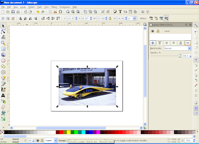
Step 1: first things first, go and grab a picture of the car, as seen above. Right click on it, and save it. Then import that picture into your inkscape program.

Alternately you can just drag the image from the website into inkscape and choose to embed it that way.


You will notice that the image is bigger than the page. Not only that, but it would make more sense if your page was “landscape” rather than “portrait.” (Land scape is horizontal, portrait is vertical.

Step 2: Select the [FILE] menu, and go down to [Document Properties] (note: take a moment to realize that beside the document properties option is the hotkey SHIFT+CTR+D. This means that you could alternately open the [Document Properties] by holding SHIFT, and CTRL, while pressing the D key.)

Inside Document Properties you will see, near the middle, something reading “Orientation.” There are two options here: Portrait and Landscape. Click on the circle beside landscape. Then close the Document Properties and resize your image so it fits in the page.

If you resize while keeping the CTRL key held down, it will keep the same ratio. If you’re unsure what that means, just try to resize by holding CTRL then try without. It will make sense soon.


Step 3: You may have noticed that in these screen shots there is something different from what you see on your screen. There is a vertical rectangular box to the right of the screen. This is the pallets window. To open this you just need to open one of the many pallets.

We will be working with LAYERS first.

You can select the LAYER menu from the top of the screen and then select the last option in that menu, LAYERS.

This will open up the box. Note that you could alternately bring this up by pressing SHIFT+CTRL+L

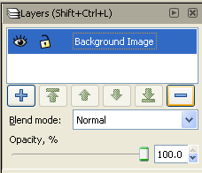
Step 4: You will notice that you already have one layer titled Layer. That’s all fine and well but that name doesn’t tell us much. Click on the title and you will be allowed to rename it. Rename it as “Background Image.”


Breakdown of the box, from top to bottom:
Title of the Layers box (triangle shows/hides pallet, X closes it.)

Your first layer, renamed as “Background Image”
The open eye means you can “see” the layer. Click it to hide the layer.
The open lock means you can edit the layer. Click it to write protect it.

The Plus and Minus allow you to delete or add layers

Blend mode lets you play with effects. Don’t worry about it just yet.


Opacity allows you to make the layer “see through.” Don’t worry about it yet.


Step 5: Time to get to work turning the car from a real image into a vectored image. This may seem difficult, but really it’s the each same as making the basic shapes you created earlier.

Click on the Plus button to add a new layer. You have the option to name the layer. Call it “CAR YELLOW.”

You will use this layer to create the basic yellow shape of the car. Using the Curves tool trace the yellow outline. It’s OK to cover objects that are not yellow. Try to outline the entire body, with the exception of the large roof/windshield.

Once your outline is created, click on the yellow from the colours at the bottom and you will have a basic yellow shape that, kinda/sorta looks like the car.


Step 6:
Create a new layer once more, and name this “BLUE GLASS.”

This time trace the blue windshield as it curves along the top of the car. For the bottom you don’t have to be so precise. Just click anywhere in the yellow, so that the blue overlaps. Once this object is joined click the blue colour from the selection bar below.

[note: it’s important to make sure you’re editing on the layer you wish to be. To check this, before drawing a shape, make sure the layer you want is highlighted in the layers pallet. At the bottom of the screen there is a drop down beside the small eye and lock which states the name of the layer currently being edited.]
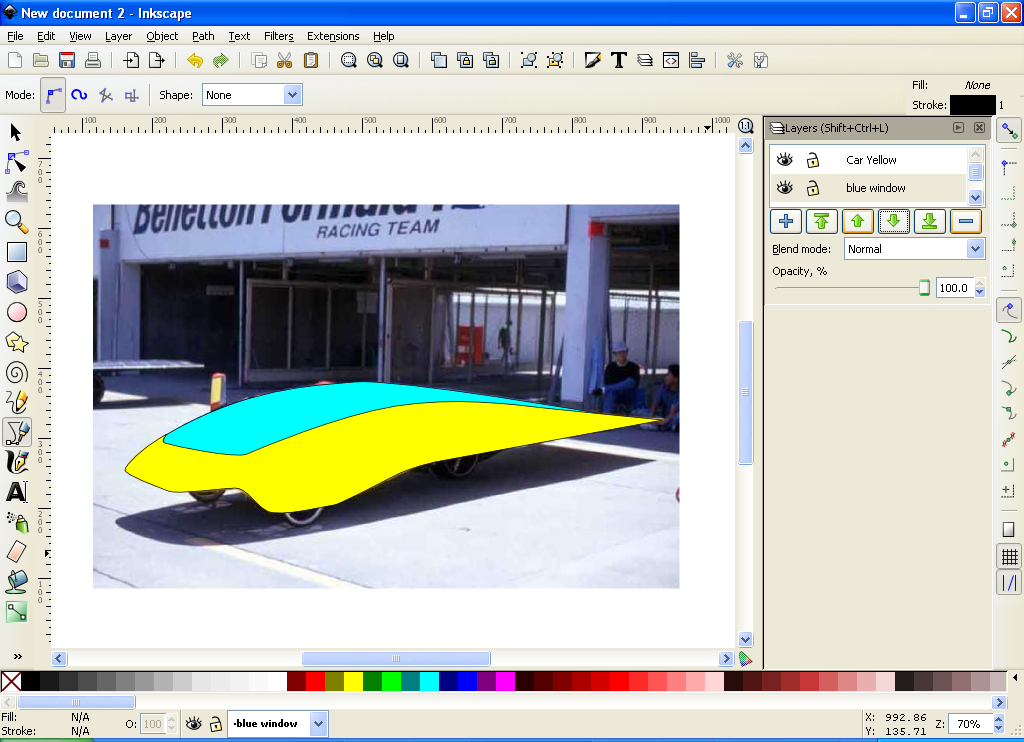
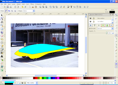


Step 7:
By now you have realized that your car doesn’t quite look right. You want the blue behind the yellow. Well that’s easy enough to do. In the Layers pallet select “Blue Window” and then click the little green “DOWN ARROW”. Your Blue Window layer will drop down behind the Yellow Car layer.

Layers display themselves in order of highest (Topmost) to lowest (Bottommost.) If you clicked the down arrow with the line under it that would send the blue window to the very bottom, under the background layer, making it completely unseen.
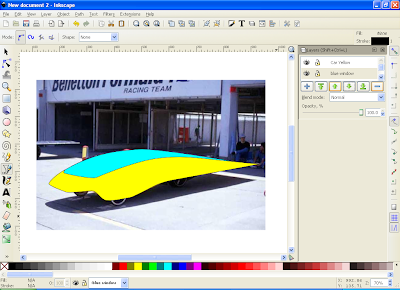


Step 8:
It’s time to add the wheels. Create a new layer and name it “Wheels.” You now want to trace the wheels. But this may be difficult as it’s hard to see the full outline behind the yellow car layer. That’s not a problem. Just select “Yellow Car” in the layers pallet, and click the eye. This will turn off the Yellow Car layer, until you turn it back on again. [Note: when a layer is turned off the eye is closed.]

Now re-select the “Wheels” layer and start to trace your objects. These will need to be traced precisely, as this layer will be ontop of the “Yellow Car” layer, rather than behind it.

Once the three wheels are completed, fill them in Black. Then turn on the Yellow Car layer.

As we want the wheel on top of everything, click that layer, and then click the Green Arrow with a line ABOVE it, just to be sure you’ve brought the Wheels layer to the very top.

Now, lets take a look at your image. Click on the eye for “Background,” and you will be left with just what you have created, hiding the rastered image that you are tracing.


Step 9:
Alright, you’re getting there. You have a car that looks – kinda, sorta – like the car. A few more details, and you’ll be there. This step requires you to think back on what you’ve just done – but I have faith in your abilities. Turn on the background layer once more, and then:

Hide the yellow car layer and the blue windows layer.
Create a new layer called “black siding”
Trace the black siding on the care, fill it in black.
Create a new layer called “Fins”
Trace the two Fins (mirrors?) at the front of the car, and fill them in red.
Move “Fins” and “black siding” to the top, and then turn Yellow Car, and Blue Window back on. Turn off “Background.”


Step 10:
You now have a car. That, kinda, looks like the car. But it has some problems. First, the colours. They’re terrible. So now lets learn how to change the colours. Turn “Background” back on.

Open the Colour Pallet by clicking on the OBJECT menu, and selecting “FILL AND STROKE” Alternately, you could hold CTRL+SHIFT+F.

Now that this is open we can begin to make the colours, less terrible. With the Fill pallet open click on the Yellow Car object, and once selected you can begin to edit the colour. There are many ways to do this, RGB, HSL, CMYK, Wheel, and CMS. I prefer CMYK and Wheel.

Choose a colour the best fits the car. If you’re having trouble there is another option.


Step 10b:
You can choose the colour using the eye dropper tool. This may be at the very bottom of the tool pallet on the left, or if the whole pallet can not be shown, you may have to click the two arrows, and then choose “dropper” from the list of hidden tools.

With the dropper selected, click on the big X just under the word fill. This will turn off the current colour. Now you can click on the rastered image, itself. Note, each time you click you can undo your choice by pressing the big X once more, or using keystroke command CTRL+Z (this will undo whatever your last action was.)

Step 11:
Change the colours of the window, and the mirrors to something of your liking as well.

There we go. Looks better already. But still – something is missing.

Adding Highlights

Now, just to complicate things, I want you to hide all the layers, except for “Background.” It’s time to make some highlights and shadow layers. This is no more / less complicated than any of the other shapes you’ve created. You just need to think about where the best place to add the highlights and shadows should be.

First, create a layer called “Yellow Highlights” and move it to the very top. [note: you may want to hide the Fill Pallet while working with the layers like this. Refer back to the earlier “Layers Pallet” image to see how to hide the pallet.]

You will notice that the front of the car is a much brighter yellow. Begin to draw a shape that closely follows the bright patterns of the car. You may also want to select some of the bright lines at the rear of the car.

Select all your highlight shapes, then grab the dropper tool and find a good light yellow colour from the car. With those shapes filled in, you can move on and create the shadows.

To do this it is the same process. Create a layer called “Yellow Shadows” and draw shapes where you want the dark areas to be. Then select the dropper and choose a good dark yellow from the image.

When this is done, you may turn the “Yellow Car” layer back on.


Step 11b:
Repeat this process by adding highlights to the wheels on a layer called “Wheel Highlights” and block off the darker part at the front of the windscreen in a layer called “Windscreen Shadows”. Finally make layers to add the various colours to the fins. You should end up with something resembling the image below. [note: windscreen shadow must be below the fins layer, else you will obscure one of them.]


Step 12: Something still isn’t right. All those ugly lines surrounding the objects. Surely there must be a way to turn them off. And there is.

Turn off the “Background” layer, and then select all your objects. You can do this by SHIFT+[click]ing all the objects, but there’s an easier way. Press CTRL+A. This will select all the objects on your current layer. Even still, there are a lot of layers to select. So press CTRL+ALT+A (or select it through the menus by pulling down the EDIT menu, and choosing “Select All in All Layers” near the bottom of the menu.)

With everything selected go back to your Fill and Stroke pallet. This time choose the “Stroke” tab (beside fill at the top of the pallet, on the other side of Stroke Style.) Right now the stroke is selected as a single layer black. You can change the colour, but best to just click on the great big X to turn off all the strokes, and leave you with just the coloured objects.


Done and done. It’s just that easy.
[Yes, I do understand that this image is far from perfect. Think of it as an indication of how yours should look for a first time through. Does yours look better than this? Fantastic! Does it look the same? That's very good. Is it worse? In what ways - how could you improve next time?]


Final Instruction:When finished, try your hand at vectoring at least one more of the cars below. You can create new layers to vector in the backgrounds, or reflections if you desire. The amount of effort and detail you put into your work is up to you - but you should start exploring various ways to flesh out your images, and by adding more than the basic subject you can achieve stunning results.


Introduction to Vectoring


  • Vectoring is a basic way to turn a complex design into something more basic, and – appealing.

  • Vectoring uses all sorts of complex math and curves to draw shapes and images… luckily you don’t need to know any of that to make your pictures. You just need to know how to use a computer mouse.
  • We are using the free software Inkscape which you can download for your home computer at inkscape.org

  • Inkscape may take some time to get familiar with, but – honest and true – it’s far easier than you may think it will be.
The image at the top of the screen was created in a little under two hours. To be fair, this was the first time I had used inkscape, and it took some getting used to. To recreate it might take an hour, give or take. Eventually you will get there.

But we're going to start with something simple. We're going to start with getting you to trace a circle.

Instruction #1: right click on the circle image below, and save it to your computer.


Instruction #2: open inkscape on your computer.

Instruction #3: drag the circle into inkscape.

Instruction #4: you will notice that the circle appears in a dotted square box. Drag that circle so that it is fully within the black rectangle within Inkscape. [this black rectangle is known as "your page".

While you can work outside of "your page" when you render (save the final image) only things within "your page" will be shown.


You should now see a screen that resembles the one below:


Instruction #5: Zoom into your circle as close as you can, while still showing the whole thing. You can do this by clicking the “microscope tool”, or by holding down the [CTRL] key while moving the mouse wheel up or down. ([SHIFT] + microscope tool zooms out.)


Instruction #6: Let the math begin (again, we don’t need to worry about the math. You just need to click the button that allows you to draw curves. It’s the eleventh from the top. It’s below the pencil. It’s a blue writing tool with a line that has a square attached to it. Can’t miss it:


Instruction #7: Now it’s time to start drawing your circle on top with the “curves tool”. But how do we do that?

Click on the screen. You will see that a box just appeared with a red line attached to it. Click again, another red line jumps out. You can keep clicking all you want, until you click the first box and complete the “shape.”

Once the “shape” is complete you can select it, and change it’s colour, move it around – or, in this case, delete it.


Instruction #8: With the “curves tool” selected, you need to click at the left, top, right, and bottom of the circle. The points of where to click are shown on the circle below:


But wait, you say – you’ve now ended up creating a diamond. That’s not right. Still – this allows up the opportunity to explore how colouring an object works.


Instruction #9: Down at the bottom of the screen you will see a row of coloured boxes. These represent the “fill colour” (don’t worry about this yet – just know you’re choosing what colour the “shape” will be.) Select blue.

You will now have a blue diamond in a red circle:


Instruction #10: It’s time to edit our shape. You can modify any shape you have already created. To do this click the second tool from the top (an arrow pointing at the middle of three squares on a line.) This is the “edit shapes” tool.


Instruction #11: You will notice the row at the top of your screen has changed. There are new tools and icons. Make sure the second from the end is clicked (depressed.) This will show “handles”. Trust me, this will become clear soon.

You are now looking at a screen that shows the blue diamond, with a box at each joint. You can click on them and move them around if you’d like – go on and try. But then, put them back in their original position.


Instruction #12: With the [SHIFT] key held down, click on one of those squares (they’re really called “nodes”) and then drag (move the mouse with the left button held down) away from the “node”

You’ll notice a blue line attaches to the “node.” This is the “handle”. See how by moving the handle you’re changing the curve, allowing the shape to become more of a circle?


Do this for all the nodes, until the blue circle covers the red one.


Instruction #13: Yes, of course there is an easier way. Delete the blue circle, and then select the “curves tool” again. This time, click to place your first square. When you click to place your second square do not let go of the mouse button. Click and drag to pull a “handle” out and curve your line.

This may require some experimentation to get right, but eventually you will be able to trace your circle by clicking and dragging “handles” using the “curves tool.”


Final Instruction: Once you have finished tracing the circle above, you should do the same with the two shapes below. You can choose to make them any colour you wish.


Bonus Instruction:[Removed]

Tomorrow we will be looking at how to create images like this, and I will provide step by step directions - but for now, if you want to try and figure it out, go ahead. There are more tutorials you can look at in the previous post, and you may also want to google +inkscape +tutorials to find more information.

Monday, September 9, 2013

Careers in Media

Due to the ever widening role of social media, media jobs are constantly being created. However, due to the ever widening role of social media, the number of applicants is growing disproportionately to the amount of jobs. This is especially true in large urban centers like Toronto.


Jobs in Media
Using either, or both, of the job search sites below, look up four careers in different fields (video, audio, computers, etc.).  Try to find Toronto (or GTA) based jobs, if possible.

http://www.mediacareers.ca
http://www.workopolis.com/jobsearch/browse-jobs/arts-media-and-entertainment-jobs#ch=17&lg=EN

For each of the four careers, answer the following questions:
  1. What is the job title?
  2. How long is the job for (full time?  Contract?  What length of contract?)
  3. What is the approximate salary?
  4. What skill sets, or prerequisites are required for the position (prior experience, software training, etc.)?
  5. Write a short paragraph, fully detailing what your responsibilities would be in this position.  Do not make a point form list.  Be sure to include very specific details.
  6. What is the link (URL) for the job listing?

Tuesday, September 3, 2013

Welcome to EMS3O1

Welcome to EMS3O:
Over the next five months you will create a number of different projects, ranging from static images to motion video.  There will be an opportunity to look at movies, comics, popular culture, advertisements, and more.

As we move through this hands-on, computer oriented curriculum a number of new skills may be presented.  While it might seem like a challenge at first, knowing that you're part of a larger network might be of some help.  There are tutorials on the internet for just about everything.

And, of course, there will be tutorials presented in class as well.

Step One:
The first thing you need to do is create a virtual portfolio.  To do this, you need to head over to http://www.blogger.com/ and set up an account.  Don't worry.  They're free.


Blog Step 1:
Head on over to blogger.com


If you have a Gmail account then you can use that, otherwise click on “Get Started.”


Fill out the information.


Blog Step 2:
Name your blog. Then enter the address for it. The address will be http://[NAME].blogspot.com


Blog Step 3:
Once you have set up your blog you need to choose a template.

Choose Design / Template Designer / Templates

Choose something you like, and then click on “Apply to Blog.”


Blog Step 4:
Click “Back to Blogger”

You now have a basic blog where you can upload your projects. To upload a project click on “Posting.”


Blog Step 5:
In a new post you can title your assignment, and then write a brief description of what you have created, and why. Explain your colour choice, subject choice, and any other choices you think may be important.

To attach the image simply click the “Add Image” button (third from the right on the icon bar.)

Once uploaded, the image will be added to your post.

Blog Step 6:
Click the “Publish Post” button.

Final Step:
Make sure you have e-mailed your teacher the address of your blog so that he/she may check your assignments.
 
Step Two.0:
Check out a few of the "About Me" sites linked below.  They are from professional websites and may help you accomplish Step Two.1.

http://wedding.brentlewin.com/#/about-me
http://rachelpickphotographyblog.com/about-me/
http://blushweddingphotography.org/vancouver-wedding-potographers/about-us

Step Two.1:
Once you have your account, your first assignment will be to write a brief introduction about yourself.  You can format it in a question and answer style, or work it into a fully developed personal essay.  But, you must answer the following question in no less than 500 words (combined.  Don't worry.  You don't have to write 500 words for each and every question.  That would be crazy.)

You can go over 500 words if you'd like.  That's up to you.

The Questions Are:

  1. What is your name?
  2. What is your background with computer technology?
  3. What do you find most exciting about media?
  4. What is your favourite commercial, and why?
  5. A little bit about your background - where you're from, etc.
  6. What is your goal in the world of computer design / creation?
  7. What do you look forward to most (audio, video, or image).
  8. Any other information you think is important.


Step Three:
Once you are done with your written piece you may head on over to Facebook, or some other sort of site in which you have photos of yourself.  I would encourage you to add your image to this introductory piece.  After all, this is your virtual portfolio that you can use to show others your skills.  And, having your face associated with your name, is of great importance in the industry.

Step Four:
Create a text document [Right Click on the desktop] / New / Text Document
In the file copy and paste your website's address http://[yoursite].blogspot.ca
Save the text document.

Copy it to Barltrop/Media in the Drop Off folder.
[Double Click on Kipling CI] (a folder on your Desktop)
Open [Drop Off]
Open [Barltrop]
Drag your text file into [MEDIA]

Follow Up:
Your mark for this assignment will be a completion mark based on the following:
  • Did you drop off a text file with your site's address in it? (If this step is not completed there will be no marks awarded for any of the following aspects)
  • Do the 500 words or more answer the questions that were posed?
  • Is your Blogger site ready to act as an online portfolio for the rest of the school year?